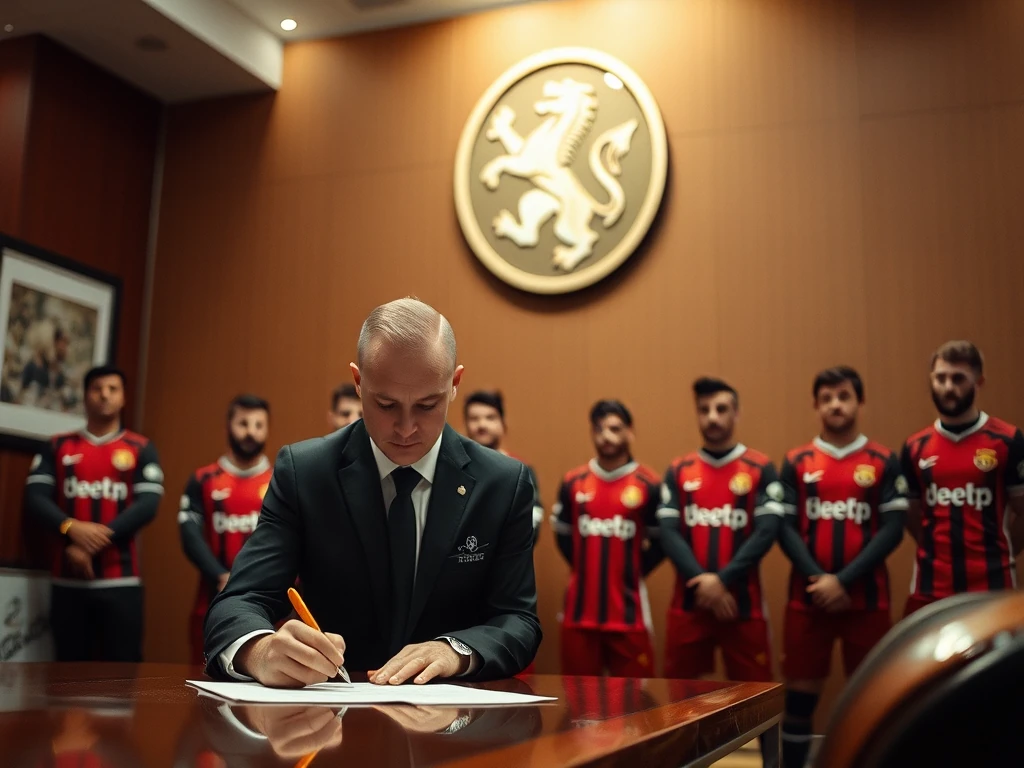

Lincoln City have launched their new away kit for the 2026/27 Championship season, sparking debate among fans. The bold design features a striking color scheme and modern patterns, but opinions are split on whether it’s a stylish update or a misstep.
The kit introduces a vibrant purple and black theme, a departure from the club’s traditional red and white. The jersey includes geometric patterns along the sleeves and a textured finish, aiming for a contemporary look. Lincoln City’s crest remains central, with sponsor logos placed subtly.
Some supporters praise the kit’s uniqueness, calling it a refreshing change. Others criticize the color choice, arguing it doesn’t reflect the club’s heritage. Social media is buzzing with fans sharing their thoughts, from excitement to disappointment.
Kit sales are a key revenue stream, and Lincoln City will hope the divisive design drives interest. The club’s marketing team has emphasized the kit’s modern appeal, targeting younger fans. Whether it becomes a hit or a flop may depend on on-field performance this season.